Designing a quiet instrument
Most assistant apps pick one of two costumes. Either the chat window, a text thread cosplaying as a person, or the productivity dashboard, all charts and badges asking to be checked. We didn't want either. The design brief we kept coming back to was four words: built like an instrument.
An instrument, in the cockpit sense. Dark ground so the information glows instead of shouts. A dot-matrix face for numbers and labels, because readouts should look like readouts. Hard edges and zero rounded corners, because softness everywhere is how interfaces apologize for wasting your time. Every element on screen answers one question: what is worth knowing right now?
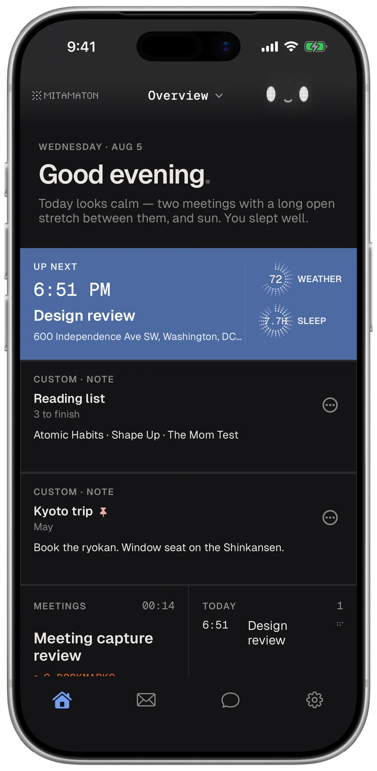
The home screen came out as a board of cards. Each card holds one thing worth knowing, sized how you want it, arranged how you want it. The board packs itself tight and then leaves itself alone. It reads at a glance from across a table, which is the real test of an instrument.
And then there is the small face in the corner. Mitamaton has a character in it, drawn in the same dot matrix as everything else, and giving it a face was the riskiest call in the whole design. The rule that makes it work: the face earns its place by doing something. Its posture tells you whether it's working, whether it found something for you, or whether everything is calm. It never roams the screen, never performs, never begs for attention. It sits where an indicator light would sit, because that is what it is. An indicator light you can end up caring about.